I’m learning Modo 701 still and I figured I’d play with materials today. I ended up making this weird tinsel thing.


I’m learning Modo 701 still and I figured I’d play with materials today. I ended up making this weird tinsel thing.
Unfortunately things went a bit hyper busy over the last couple months. I’ve been involved in a couple interesting projects including music related material to video art. In some ways, I just couldn’t get to writing material or make tutorials for this blog. Either way, I plan to return to blogging once I manage to straighten life out.
Either way, I guess I should keep the rest of this blog a bit more artsy. Here’s some of the thing’s I’ve been up to in no particular order and of course… this isn’t all! 🙂

Landscape for a comic.

My name cards printed by Moo.

Cosmos character sketch from 2012 that I happen to dig up.
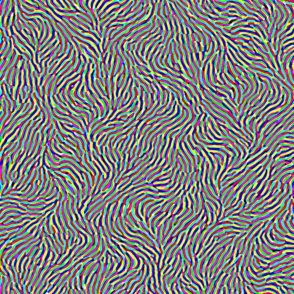
Reaction – Diffusion patterns made with FilterForge

Pompom iPhone Case that I put together

Brute force coloring reaction diffusion patterns using Nodewerk
Photographs of hell from 2007. (Works presented on Behance and Cargocollective.)


I just hope I don’t stop making a ton of videos. I have a couple in stock but let’s just say I’m going to do my best making videos once a week. It’s crazy. But I really want to push it to the limit. Some of these might be simple, some of these might be complicated than others… and that’s the joy of making something everyday.
Here’s a new one for this week!
Music video for myself: “Take That Thing Off My Couch” by me. Used After Effects and Premiere CS6, fractals were achieved using Artmatic 5.
And just on that… here are some screencaps from the animation.


So I’ve been making some more music these days and haven’t made too many visual art. So here are 4 tracks I made in the last couple weeks mostly for fun. I used Properllhead Reason for all of them. 🙂 I’ve been getting more and more into Future Garage oriented genres (although I don’t even know what the genres are in this set.) They’re live-oriented genres that can seriously spawn a bunch of great musical pieces.

… that was one hell of a dream.
I’ve never really been able to do pixel art but lately I’ve been getting really into it. I guess what appealed was its simplicity at the same time the complexity designing elements within a limited space. Of course I can always expand resolutions and otherwise.
I began drilling away at it after realizing I can just sit down and do it. I honestly find lazy ways of accomplishing complicated tasks but it seems pixel art is one of those genres of digital art that seriously forces you to figure it out by hand. Now, I’m not saying other genres of digital art don’t do that, I’m just saying the limited range of what you can do makes you think twice about where you put your pixels down to correctly portray the thing you’re drawing.
Cosmos the soulless kid. (Enlarged)
It’s only been a while since I dived into the genre and I’ve never really been that interested doing all of this. Personally, I’m not really that much of a huge fan of “games” but I do like playing them anyway. I’ve never really gone super deep into Pokemon, not a real fan of Final Fantasy series (but played it anyway). Half Life (with GMod)… Minecraft… Marathon (and 3rd party scenarios)… Crash Bandicoot… Limbo were all games I really really enjoyed but still never sat down to really think hard about developing games.

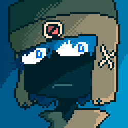
ChrisJeff Games Logo pixlated by Skybase (enlarged)
Though I guess the one game that really really got me into all this pixel goodness was CaveStory. I can’t recommend that game enough to people. It should be a requirement for everybody making games to least play it once (or 3 times depending on what ending you get). Not that I want you to 100% like it, least appreciate it. But what should be observed is the overall, endearing storyline, the lovable characters, 3 possible endings, and a ton of great game play really kicked me to think twice about making games to tell stories.

Alex the God of Concealment – Skybase (Enlarged)
There’s nothing new with what I’m doing of course. I’m more like just posting what I’ve done recently. What’s curious is the progression of where I was at initially and where I’m now…. It’s only been two months since I began dealing pixels and I’ve kinda leaned the basic skills. I figured I’ll keep moving on.

NCH Productions Logo – Pixelated by Skybase (enlarged)

The Universe Man, The God of Everything and Nothing – Skybase (Enlarged)
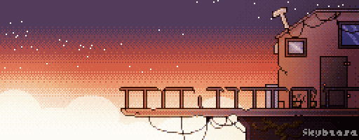
The Edge of the World – Skybase (Enlarged)
So now what? Well… I’m working on something totally fresh and something I’ve never done before fully. I figured I should make a game. I don’t consider myself a full-time game developer nor a professional one so we’ll never know when I can get stuff done by, but I’m on it totally and it’ll be good.
I hope I can write up something in the next post that explains some of the processes for pixel art textures using FilterForge a bit to help detail the pixel textures and well… otherwise help the overall look. I said I’ll write it ages ago and I never did… so I guess its about time!
It’s always a pleasure to do some collaboration work making music or anything creative. I guess for me, I like doing music a lot and so here’s one music piece we’ve made. Justin Coburn and Tim Normington are the guitarists, I’m doodling on the keyboard and also mastered the whole track. So I present to you Part-Time Platypi – These Walls.
P.S. This whole thing’s pretty new still and a bit of support would help. Whether that be liking the music on soundcloud, sharing it with your friends, reposting the link elsewhere… whatever it is, it helps. In return of course, we’ll continue making good music!
Part Time Platypi does have a Facebook page check us out!
https://www.facebook.com/PartTimePlatypi
So I decided to make a fancy facebook page for myself instead of tempting to friend a bunch of people. I update a lot of things there and it might be interesting… if you want to see more of the process-side of things, as well as more “junk” and fun things I’ve accomplished… check out the link below. Also give me a Like! 🙂
